4x5 Photo Fest
Brand Refresh | Art Direction

Challenge and Approach
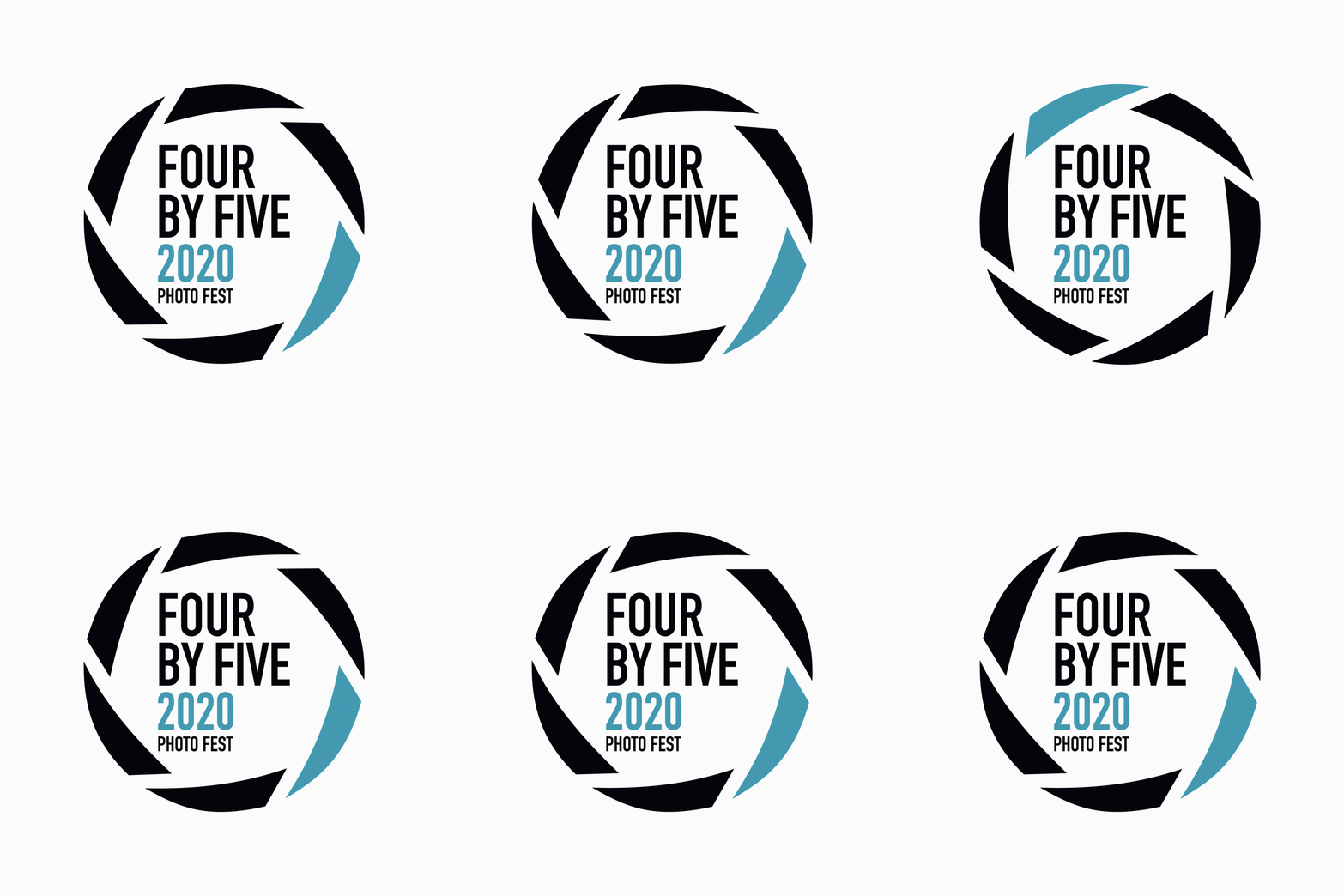
The rebranding for 4x5 Photo Fest focused on creating a welcoming and modern approach to the San Antonio-based photography festival. The festival welcomes photographers of all levels and the main goal of this event is to create a community that is based on the love of photography. The original 4x5 Photo Fest logo is a wordmark that didn’t feel like it aptly communicated what the festival is about, so I wanted to create a logo with conceptual stimulation.
Photography courtesy of Chantal Lesley.


